The mascot is not decoration. It is the product strategy.
Teenagers do not want to be lectured by a health dashboard. Uppy needed to feel encouraging, emotionally safe, and repeatable. The mascot carries instruction, encouragement, reward, and accountability, so the app can ask for commitment without sounding clinical.
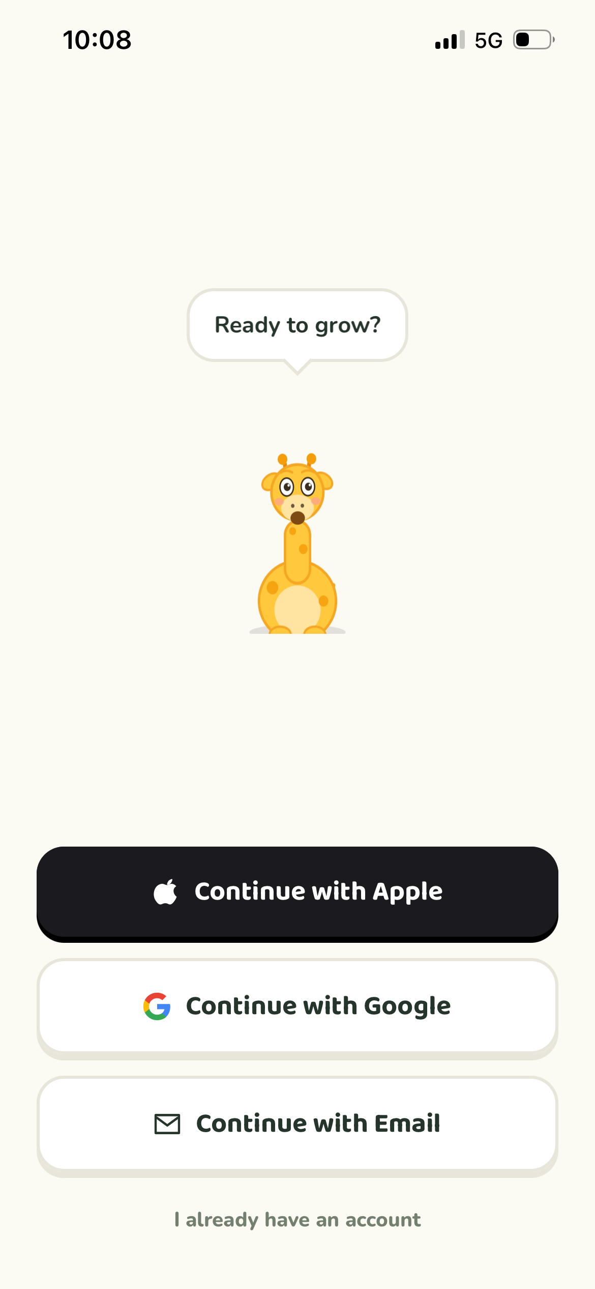
The first screen gives the mascot a voice before asking for data. That was deliberate: the app earns warmth before it asks for age, height, or commitment.
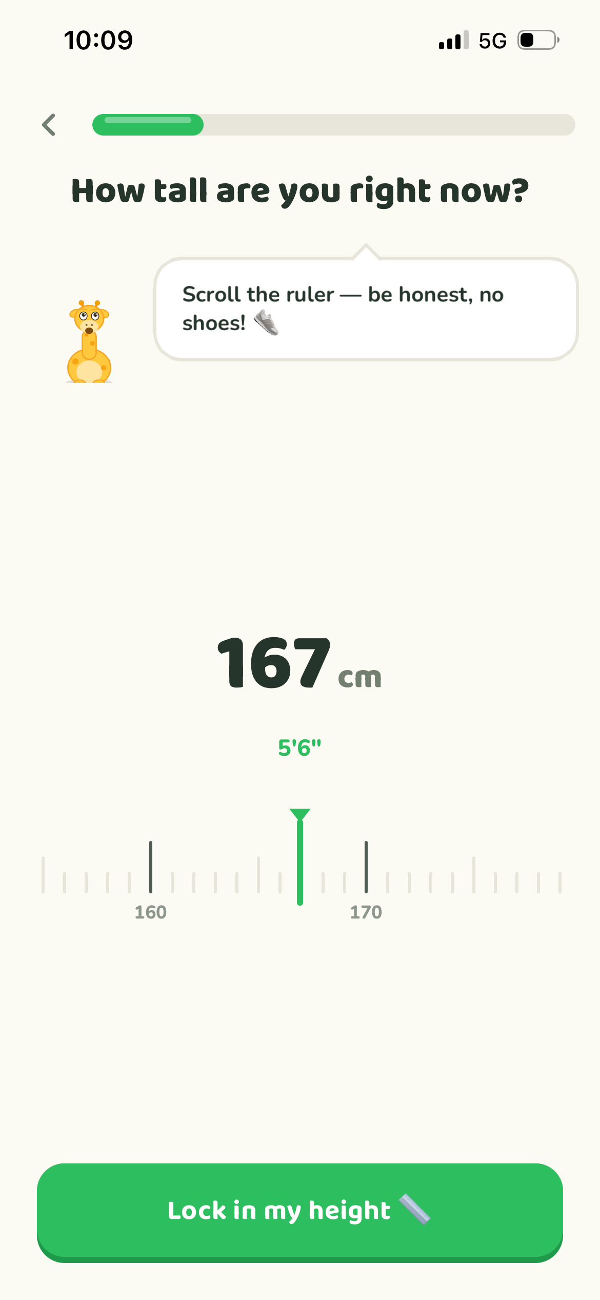
Height can be sensitive for teenagers. Playful specificity makes the input feel less awkward while still pushing for accuracy.
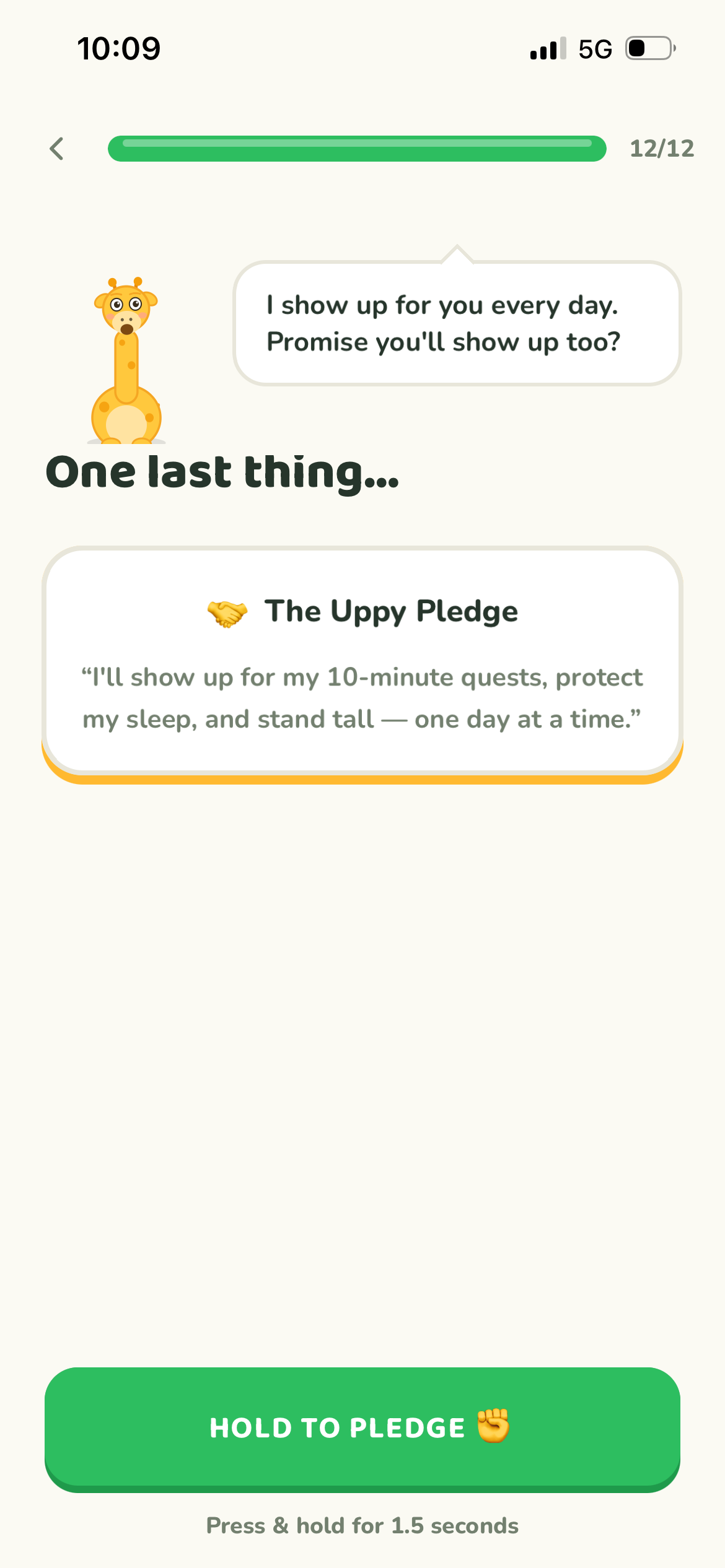
The pledge turns commitment into a tactile ritual. Press-and-hold, haptics, and a clear promise create a small moment of ownership.
Design thinking, tuned for a teen habit loop.
I used the design thinking process without reinventing it: understand the teen context, define the habit problem, prototype the emotional loop, and ship the working product myself.
Empathize
Teenagers care about growth, but the product could not make them feel judged, behind, or measured like a medical chart.
Define
The right frame was a daily growth coach: simple routines, visible progress, and emotional support in one place.
Ideate
The mascot became the voice layer for onboarding, reminders, pledge moments, in-session cues, and recovery states.
Prototype
I prototyped the actual decision moments: height ruler, commitment picker, plan reveal, home, quests, and timer.
Build
I built the React Native app myself so the sensory intent survived implementation: motion, sound, haptics, and state.
Decision 01: make progress feel relational.
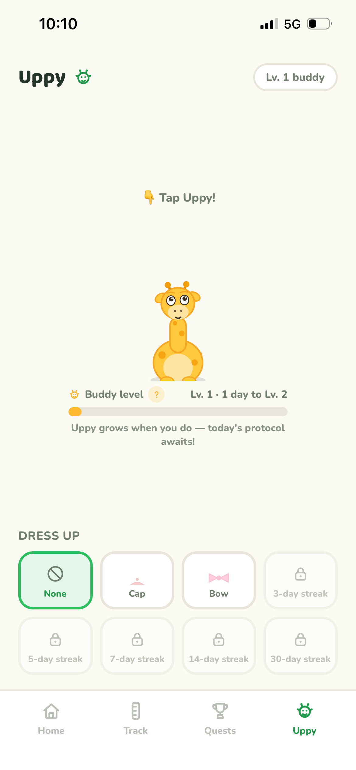
A teenager is more likely to return to a friendly coach than a blank metric screen. Uppy’s buddy system turns progress into a relationship the user can maintain.
Decision 02: keep the daily ask small.
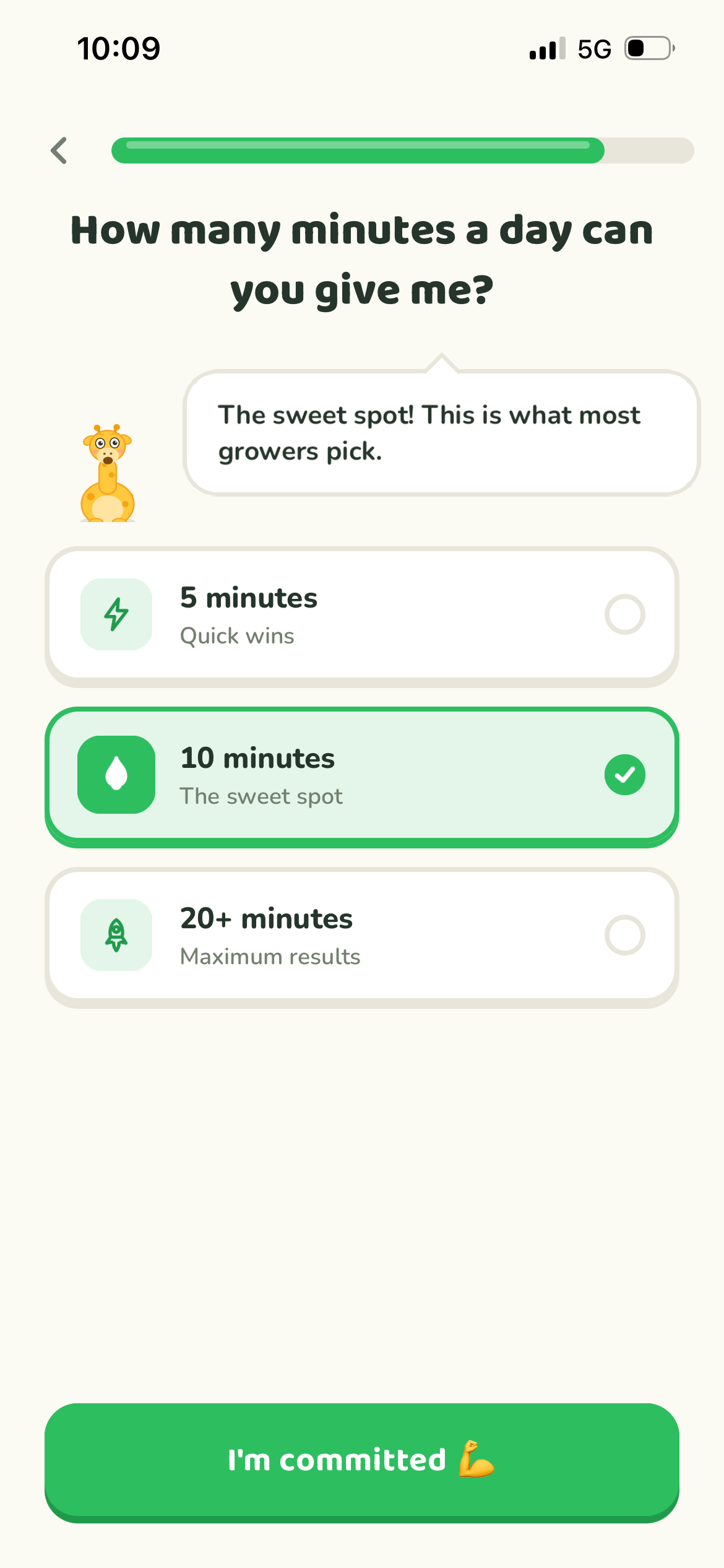
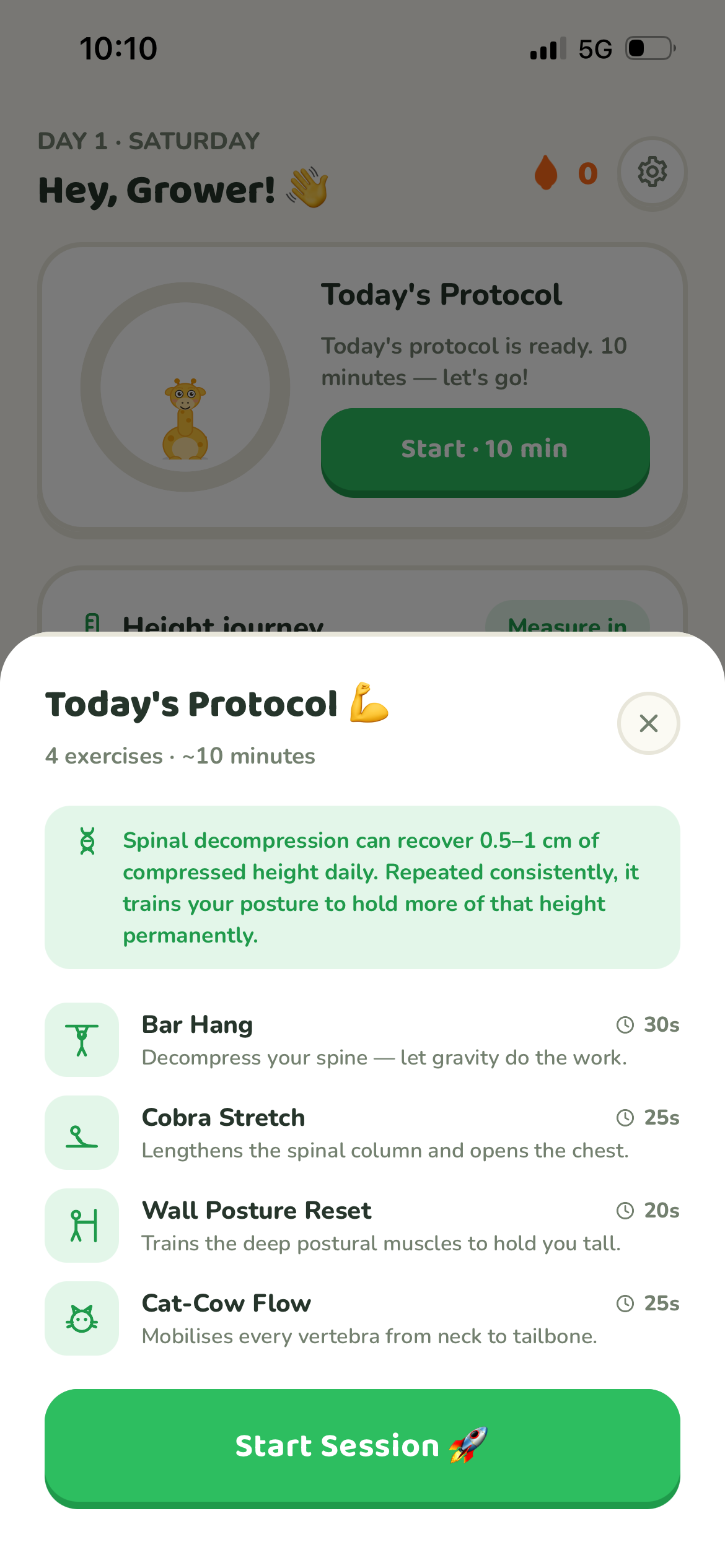
The app centers around short, 10-minute quests because confidence comes from completion. A believable routine beats an intimidating “perfect” plan.
Decision 03: use sensory feedback as trust.
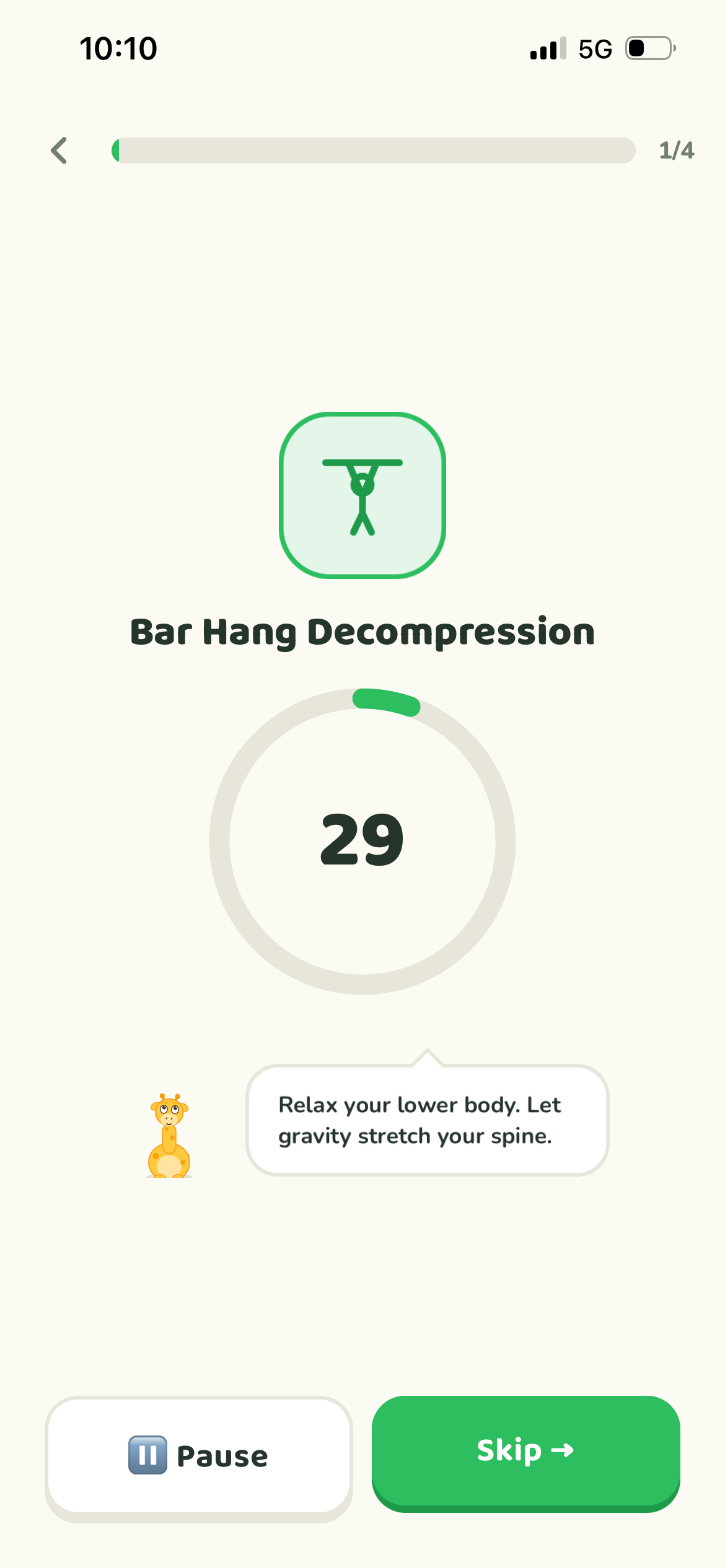
Sound and haptics make the app feel responsive and alive. They also make commitment moments, timer states, and rewards easier to understand without extra text.
Onboarding that earns the right to ask for data.
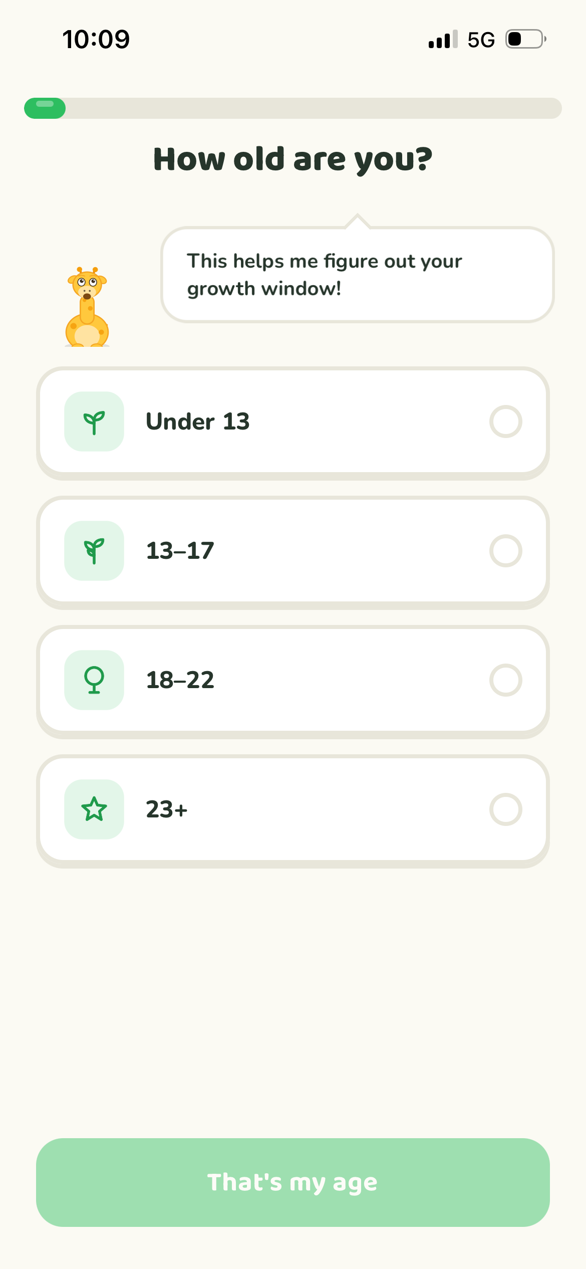
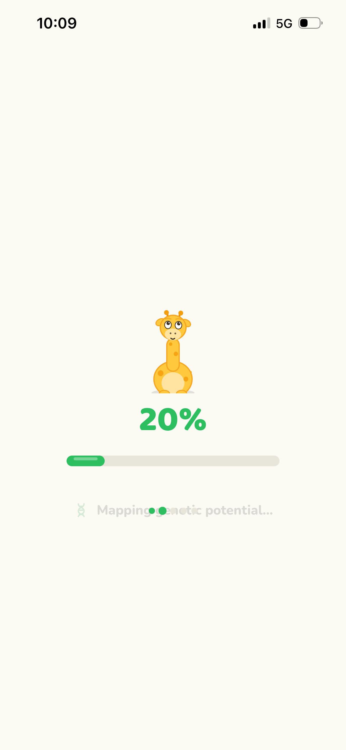
The first-run experience asks for age, height, routine commitment, and a pledge. Every step uses mascot guidance, chunky controls, and a strong action rhythm so the user feels guided instead of interrogated.
Teen-first tone
The copy avoids clinical pressure. It sounds like a supportive buddy: specific, direct, slightly playful, and never shaming. That tone is a retention decision, not a copywriting flourish.
Trust through ritual
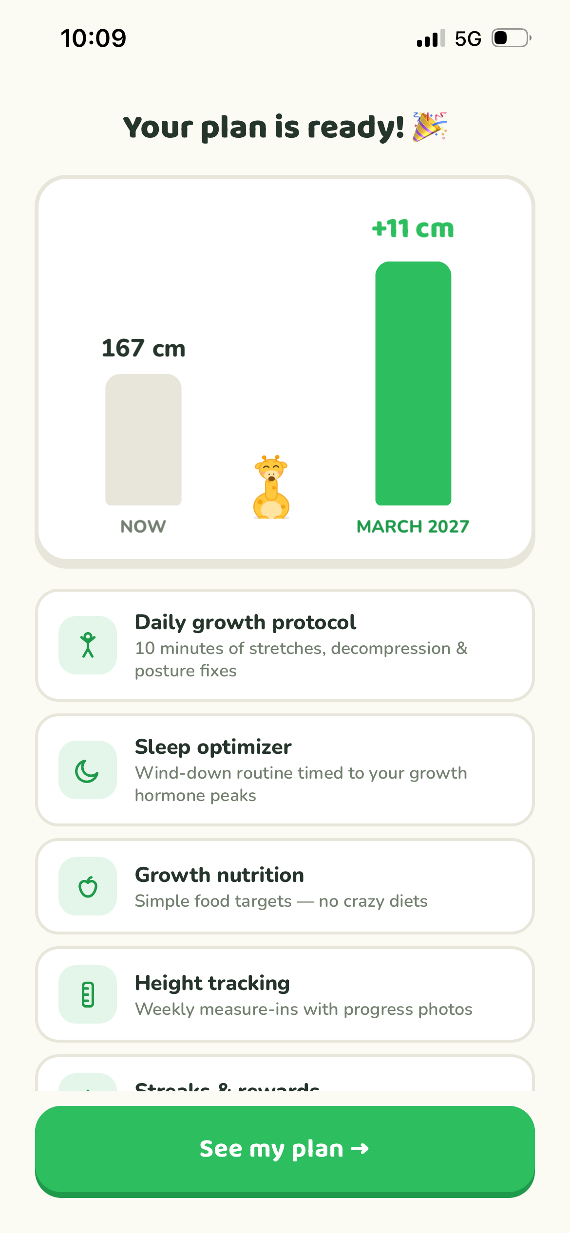
The pledge, plan reveal, daily quests, and buddy level make habit formation feel like progress instead of homework. The ritual gives the user a reason to come back tomorrow.
Guided precision
Controls like the height ruler ask for accurate inputs while keeping the interaction fun and easy to correct. Accuracy matters, but the product cannot feel punitive.
Sound and haptics are part of the behavior design.
The sensory layer makes the app feel alive: soft taps for selection, stronger confirmation feedback, voice-like mascot prompts, and reward moments that land. For a habit product, feeling responsive is part of why people trust it.
Mascot voice
Instructional copy is written as Uppy speaking, so guidance feels personal across onboarding, quests, and workouts.
Haptic pacing
Selections, press-and-hold pledge, timer states, and completion moments get distinct tactile feedback.
Reward rhythm
Progress bars, XP, streaks, levels, and buddy growth reinforce daily return behavior without visual clutter.
From first promise to daily use.
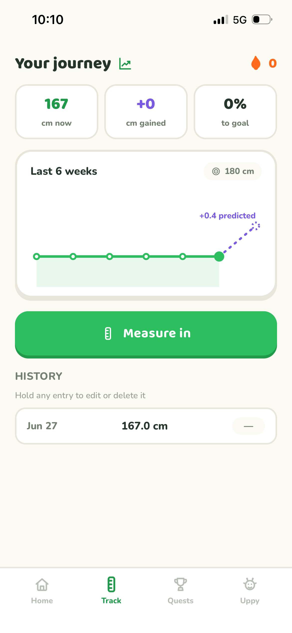
The shipped app moves from onboarding into a daily operating system: protocol, height tracking, quests, buddy care, progress history, and session timers. The product stays focused on one question: what should I do today?
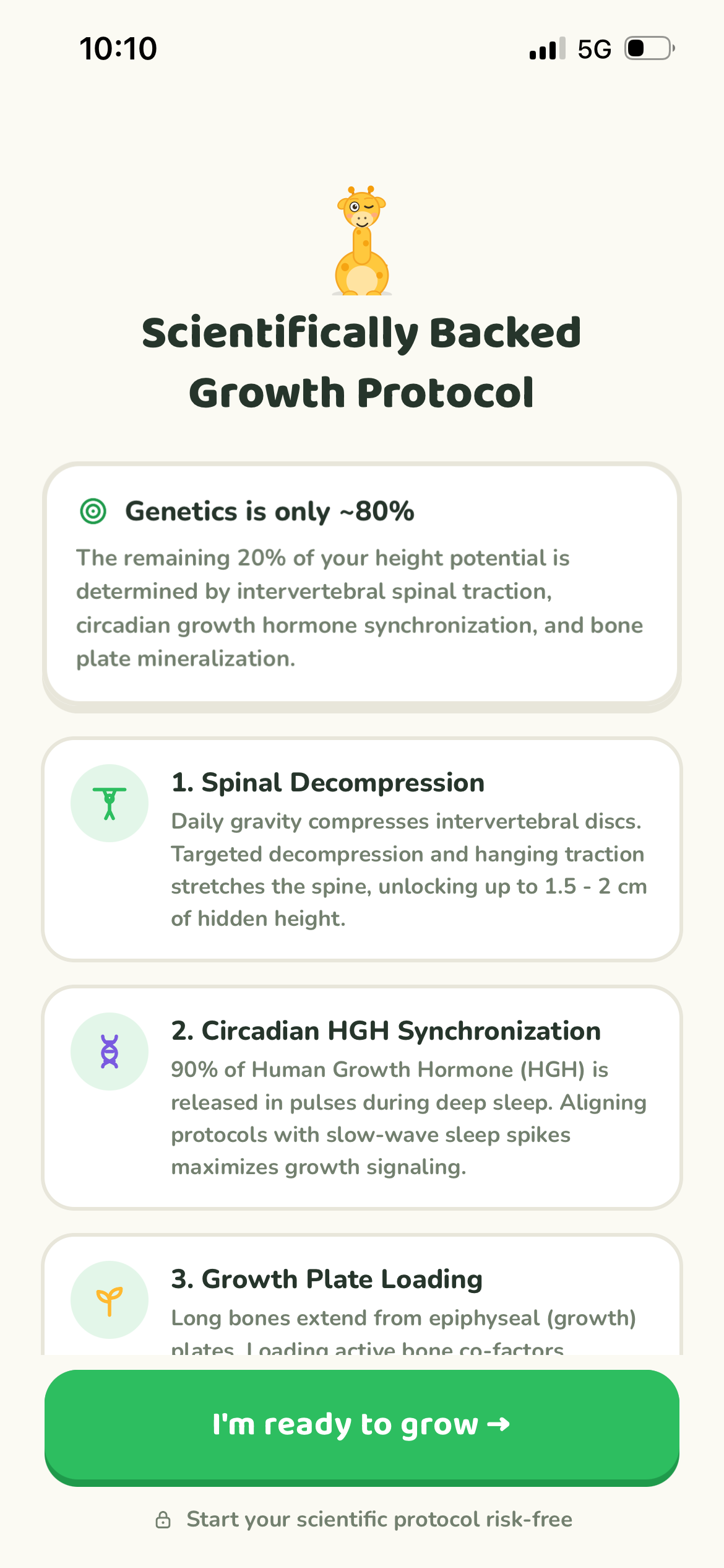
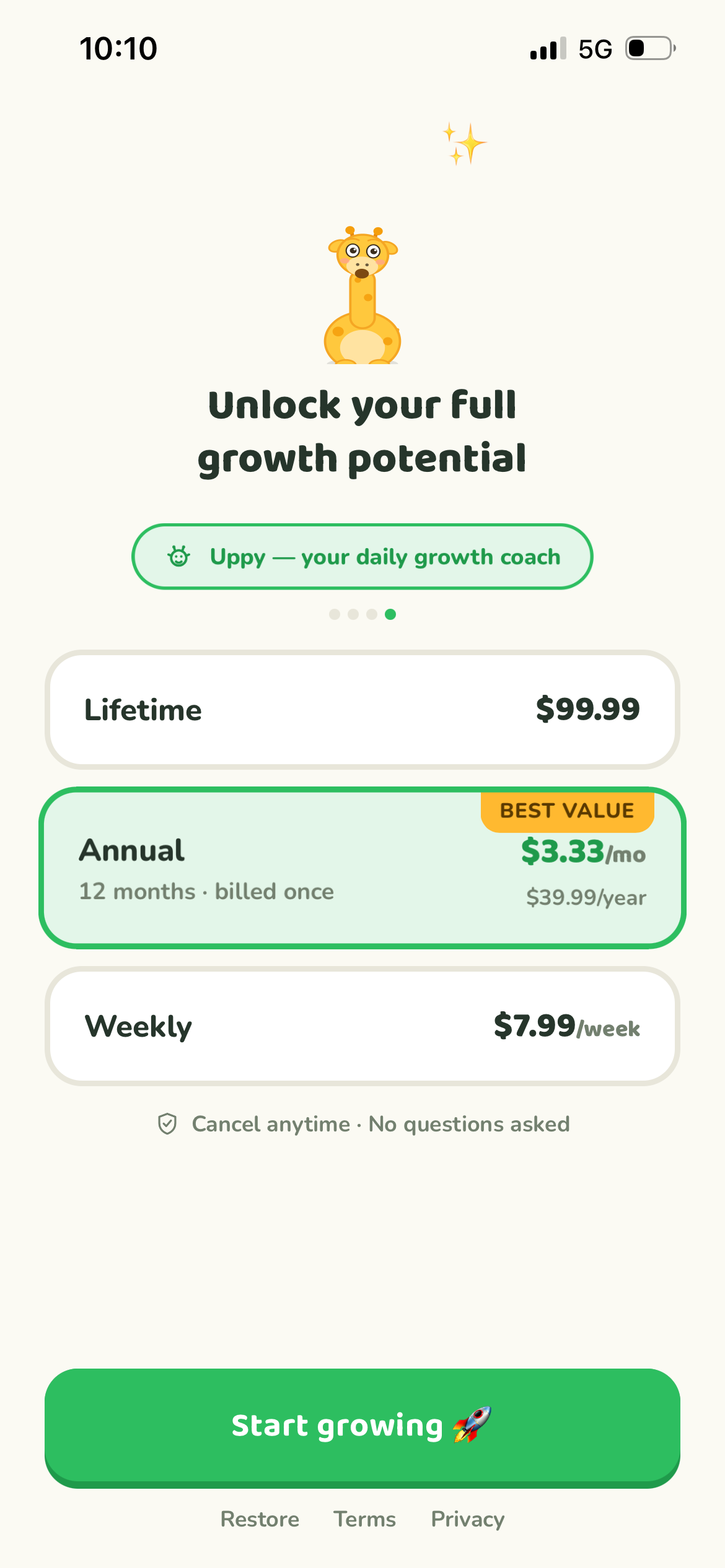
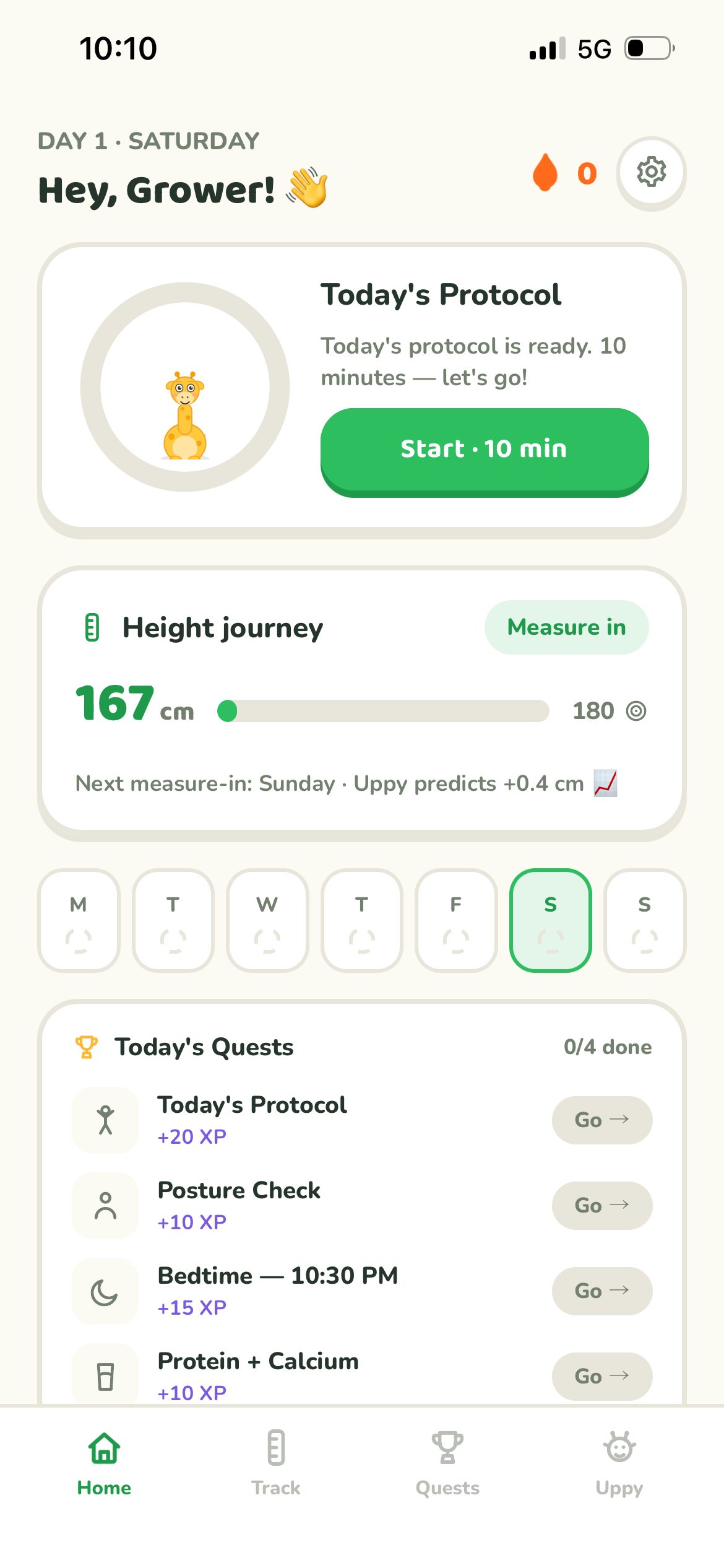
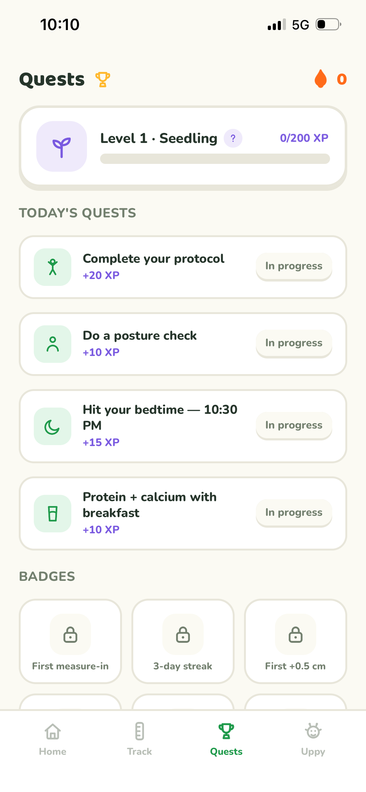
Built by the designer who drew it.
I built Uppy myself with React Native, which kept the product language intact from design to shipped product: rounded controls, mascot prompts, session states, and the sensory feedback that makes the app feel responsive.
What made the UI work.
The system is deliberately simple because the audience is young and the subject can feel sensitive: cream canvas, dark green type, thick soft borders, high-confidence green CTAs, playful icon tiles, and one mascot voice across the app.
Live now: Uppy is ready to grow.
A mascot-led height growth coach for teenagers, designed end-to-end and built solo in React Native by SJ Patra.