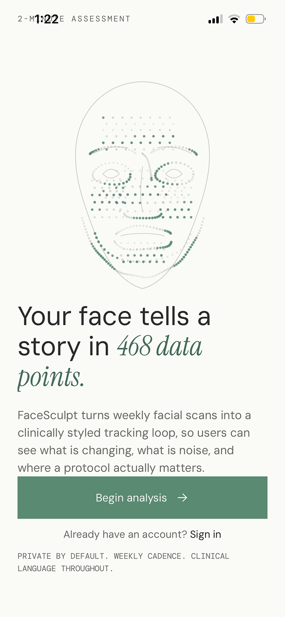
Your face tells a story. We read it.
FaceSculpt turns weekly facial scans into clinical scoring and a personalized 12-week protocol, helping users see what is changing, what is noise, and where action actually matters.
The app had to analyze a face without turning a person into a score.
The design problem was not simply showing an AI result. It was building a loop where a sensitive scan becomes a credible baseline, the output becomes a clear protocol, and the user returns weekly without feeling judged by the interface.
People want objective feedback, but appearance data can feel personal fast.
I treated scoring as a navigation aid, not a verdict. The UI separates current state, peak potential, category focus, and next action so the user always has somewhere constructive to go.
The AI had to feel precise without pretending the answer was magic.
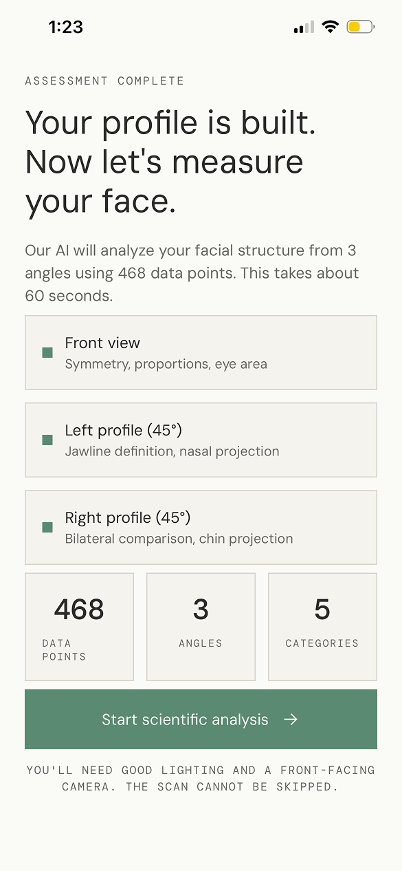
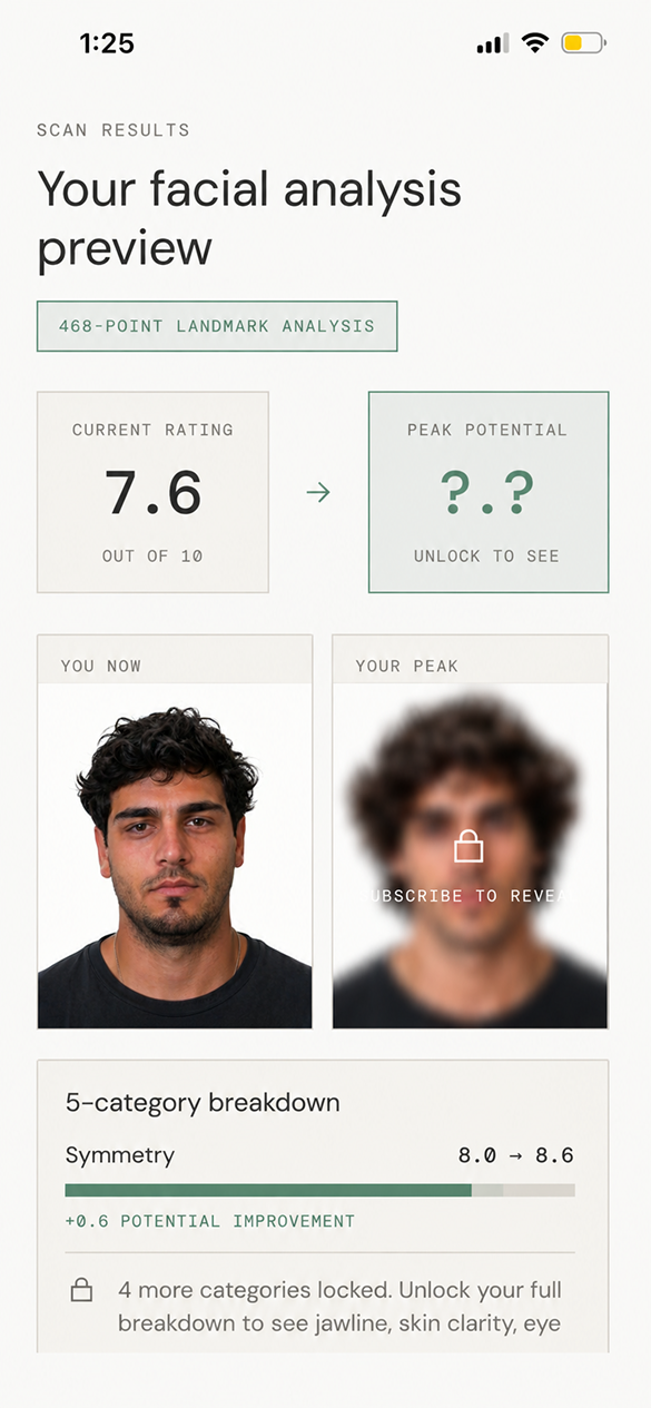
The app exposes the mechanics: 3 scan angles, 468 data points, category breakdowns, and visible confidence through repeat weekly cadence instead of a one-time dramatic reveal.
A design process built around trust, not decoration.
I used a design thinking process to move from a sensitive user problem to a shippable mobile product: understand the emotional context, define the trust gap, prototype the scanning loop, and ship the full product myself in React Native.
Map the moment of vulnerability.
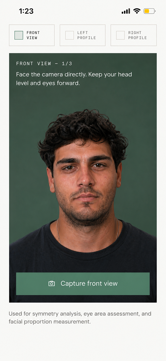
The scan flow was designed around plain instructions, privacy-forward language, and avoiding performative beauty language.
Turn analysis into agency.
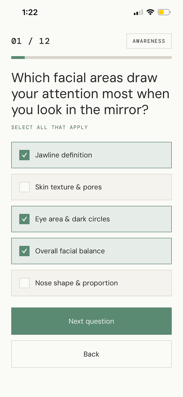
The core question became: how do we show facial data in a way that creates a next step instead of insecurity?
Separate signal from noise.
I explored score cards, locked previews, category deltas, and protocol focus tags to clarify what changed.
Design the scan loop in real UI.
The experience moved from assessment to scan, scan to report, report to 12-week protocol.
Ship the product solo.
I implemented the interface and product flow in React Native, then shipped the app live to the App Store.
The UI language is clinical, calm, and deliberately restrained.
FaceSculpt uses an off-white canvas, thin measurement borders, muted green actions, mono labels, and large editorial type. The system makes the product feel precise while still giving the user room to breathe.
The interesting work was translating AI output into a believable product moment.
Facial analysis can easily become either too vague or too harsh. I designed the AI output as a sequence: capture the baseline, preview only enough to build trust, explain the categories, then unlock a protocol that turns the analysis into behavior.
Front, left profile, and right profile instructions reduce bad inputs and help the AI output feel grounded.
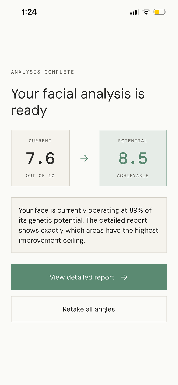
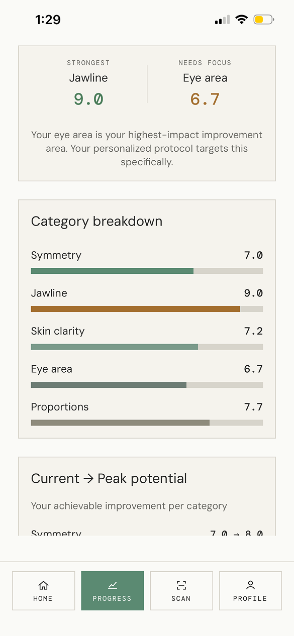
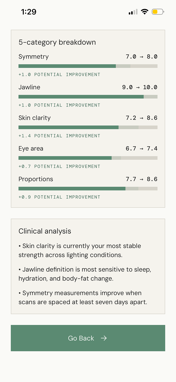
Current and potential states are framed as direction, with category improvement ranges explaining the why.
The product exposes landmark analysis, categories, and weekly cadence so the user can understand the system.
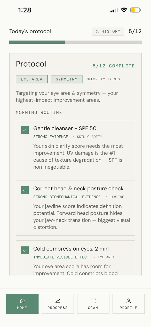
The report is not the endpoint. The app turns focus areas into daily steps users can actually follow.
From facial scan to weekly operating system.
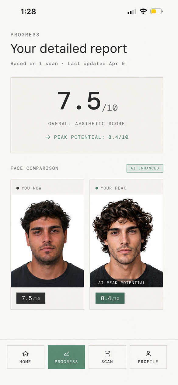
The report gives users a structured readout, while the protocol keeps the experience from stopping at insight. The key product decision was to make the 12-week plan the center of progress, not the score itself.
What changed?
Weekly scans create a comparison loop: current face, peak potential, category scoring, and plain-language clinical notes. The app keeps the analysis readable instead of hiding everything behind one composite score.
Where should I focus?
The protocol chooses priority areas like eye area and symmetry, then turns those categories into daily behavior: skincare, posture, cold compresses, and routines that can be repeated.
The product had to earn trust before it could ask for commitment.
Building FaceSculpt solo made the design constraints sharper: every UI choice had to survive implementation, App Store readiness, and the emotional reality of users scanning their own face.
AI products need visible reasoning.
Users do not need every model detail, but they need enough structure to trust why a recommendation exists.
Sensitive scoring needs gentle hierarchy.
The app uses labels, comparison, and category focus so the user reads the score as a map, not a fixed identity.
Building it myself improved the design.
React Native implementation forced clearer components, tighter states, and a more realistic scan-to-report flow.
Live, shipped, and available to install.
FaceSculpt is a working App Store product, designed and built end-to-end as a solo React Native project.
Download from App Store